Table of Contents
ToggleThe Call of Duty font isn’t just text, it’s instantly recognizable branding that defines one of gaming’s most legendary franchises. Whether you’re designing streaming overlays, creating esports graphics, or building custom loadout cards, nailing that distinctive typography can make your work feel authentically COD. The franchise’s visual identity has evolved dramatically over two decades, from the stark black ops aesthetic to the sleek modern warfare designs we see today. If you’ve ever wondered how to capture that iconic look or where to find the actual fonts developers use, this guide covers everything from official typefaces to free alternatives that’ll make your designs hit different.
Key Takeaways
- The Call of Duty font has evolved significantly across game eras, from Black Ops’ stark, high-contrast military aesthetic to Modern Warfare’s cleaner, more contemporary design—each reflecting the game’s setting and visual identity.
- Official Call of Duty fonts are proprietary and not publicly released, but free alternatives like Roboto, Inter, Montserrat, and Orbitron effectively replicate the iconic look for both casual and professional projects.
- Black Ops 2 remains the most culturally iconic era for Call of Duty typography, while Modern Warfare 2 represents the current professional standard for esports and streaming design due to its superior legibility across platforms.
- Effective gaming design relies not just on font selection but on sizing, letter-spacing, color palettes, and subtle effects—meaning a well-treated standard sans-serif can feel more authentically ‘Call of Duty’ than a misused premium typeface.
- Commercial use of fonts requires checking licenses carefully: Google Fonts are free and commercial-safe, premium fonts like Gotham and Brandon Grotesque require licensing fees, while fan-made COD fonts should only be used for non-commercial content.
What Is The Call Of Duty Font?
The Call of Duty font is the typeface used in game titles, menus, HUD elements, and marketing materials across the franchise. It’s not a single, universal font, each game and era uses different typography that reflects the game’s setting and aesthetic.
For most players, the font is synonymous with the bold, aggressive text that appears in game menus and promotional art. The franchise’s main titles often use heavily customized or proprietary fonts designed specifically for that release. Some versions feature sharp, angular letterforms suggesting military precision, while others embrace sleeker, more modern designs.
When designers and gamers talk about “the Call of Duty font,” they’re usually referencing one of a few key styles: the Black Ops series’ stark, high-contrast look, the Modern Warfare era’s contemporary design language, or the Cold War and Warzone fonts that bridge multiple game aesthetics. The importance of this typography extends beyond gameplay, it’s central to the franchise’s identity and immediately tells players which COD game they’re looking at.
The History & Evolution Of Call Of Duty Typography
Early Titles & The Classic Black Ops Aesthetic
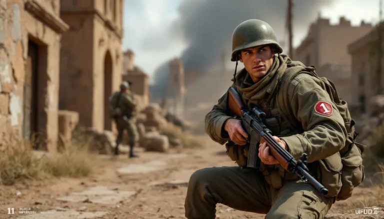
The original Call of Duty (2003) and early installments used relatively straightforward military-inspired fonts that conveyed tactical authority without demanding attention. When Black Ops launched in 2010, everything changed. The franchise adopted a bold, high-contrast aesthetic with sharp serif and sans-serif combinations that became instantly iconic. Black Ops used heavy, blocky letterforms with a distinctly noir-military vibe, think stenciled military markings translated into pixel-perfect typography.
This style dominated the Black Ops subseries through Black Ops 2 and 3, establishing what many players still think of as “the” Call of Duty look. The font conveyed urgency, authority, and tactical intensity. It worked perfectly in promotional material, on weapon skins, and within the dark, shadow-heavy UI design of those games.
Modern Warfare Era & Design Shifts
When Modern Warfare (2019) launched, Infinity Ward made a deliberate visual shift. The typography became less angular and more refined, reflecting the contemporary military setting and the game’s more grounded aesthetic compared to the fantastical Black Ops timeline. The new fonts leaned into clean, readable sans-serif designs that felt professional without losing attitude.
Modern Warfare 2 (2022) refined this approach further, introducing typefaces that worked seamlessly across multiple platforms and resolutions. The emphasis moved toward legibility and scalability, critical for competitive esports where players need to quickly parse on-screen information. The font became less about visual drama and more about functional elegance.
Cold War & Warzone Font Updates
Black Ops Cold War (2020) attempted to bridge the visual gap between the Classic Black Ops legacy and Modern Warfare’s contemporary approach. Its typography borrowed from Black Ops’ stark contrasts while incorporating Modern Warfare’s cleaner design principles. The result was a hybrid aesthetic that satisfied veterans while appealing to newer players.
Warzone, the franchise’s free-to-play battle royale hub, required fonts that worked across console, PC, and mobile platforms. Activision developed flexible typefaces that maintained visual consistency regardless of screen size or resolution. Warzone’s typography emphasizes clarity over drama, players need to read ability descriptions, weapon names, and teammate info instantly.
Official Call Of Duty Fonts & Where To Find Them
Black Ops Fonts & Variants
Activision and Treyarch have never officially released the exact fonts used in Black Ops titles, but font researchers have identified close matches. The Black Ops aesthetic primarily relies on heavily modified versions of fonts like Futura and custom military-style typefaces. Some designers have traced the look to serif fonts with aggressive letterspacing and modified glyphs.
If you want the authentic Black Ops feel, you’re looking at custom font creation or using similar fonts as a base and applying effects (heavy shadows, high contrast, strategic letter-spacing). This is why the Call Of Duty font remains elusive, much of its iconic impact comes from effects, sizing, and design treatment rather than the font itself.
Modern Warfare & Warzone Typefaces
Infinity Ward’s Modern Warfare (2019) and Modern Warfare 2 (2022) use custom fonts not available for public download. But, community research has identified fonts like Roboto, Inter, and Montserrat as close approximations for the clean, contemporary look Infinity Ward achieved. These fonts capture the modern, legible aesthetic without the futuristic or military heaviness of earlier titles.
Warzone specifically uses fonts designed for maximum readability at small sizes, which is why menu text and UI elements feel so crisp. The franchise prioritizes function here, these fonts need to work on a 24-inch monitor and a phone screen equally well.
Cold War & Recent Franchise Fonts
Black Ops Cold War’s typography is closer to proprietary designs, but community analysis suggests influences from Gotham, Brandon Grotesque, and FF Unit. These fonts share Cold War’s balanced approach: authoritative without being cartoonish, modern without sacrificing the military aesthetic.
Font Alternatives & Free Lookalikes For Designers
Best Free Fonts That Mimic Call Of Duty
If you need the Call of Duty vibe without access to the official fonts, several free options deliver credible results:
For Black Ops Style:
- Orbitron – A geometric sans-serif with a slight futuristic edge that captures Black Ops’ angular aesthetic
- Rubik – Clean and modern, works well when combined with aggressive letter-spacing and shadow effects
- Space Mono – Monospaced font that reads as technical and military when sized and spaced correctly
For Modern Warfare Style:
- Roboto – Google’s ubiquitous sans-serif that Infinity Ward’s designs likely drew influence from: clean, scalable, and readable at any size
- Inter – An open-source font specifically designed for screen legibility: matches Modern Warfare’s contemporary aesthetic perfectly
- Montserrat – Geometric sans-serif with character, works for both branding and UI contexts
Neutral Options That Work Across Multiple COD Eras:
- Poppins – Rounded geometric sans-serif that feels modern and gaming-friendly
- Lato – Approachable without being too informal, suitable for overlays and promotional graphics
These fonts are available through Google Fonts, FontAwesome, or DaFont. Most are open-source and safe for both commercial and personal projects, though always check the specific license.
Premium Options For Professional Projects
If you’re working on professional esports graphics, streaming content, or commercial projects, premium fonts provide more polish:
- Gotham (Hoefler & Co.) – The gold standard for modern branding: used in countless AAA game studios
- Brandon Grotesque (Hannes von Döhren) – Modern geometric sans-serif with personality: excellent for gaming contexts
- FF Unit (FontFont) – Engineered for legibility and sophistication: popular in esports design
- Futura (FontFont/Adobe) – The classic choice: if you want to evoke retro military aesthetics, Futura with effects is your shortcut
These fonts range from $20–$100+ depending on licensing. For commercial use in streaming, esports, or team branding, they’re legitimate investments. The price reflects the design work and ensures you’re legally covered for commercial deployment.
How To Use Call Of Duty Fonts In Your Designs
Gaming Content & Streaming Overlays
Streamers use Call of Duty typography to create authentic, branded overlays that resonate with viewers. The key is restraint, using the font for titles, alerts, and key elements rather than entire paragraphs.
Practical approach: Use COD-inspired fonts for your stream title, subscriber alerts, and raid notifications. Pair them with military-inspired color schemes (blacks, grays, reds, golds) and minimal effects. A shadow or outline works: excessive glows or distortions read as amateur. Tournament-focused streamers often go darker and more minimal, while content creators can afford more visual personality.
In OBS, Streamlabs, or your design tool of choice, set your font size generously, viewers are watching from distance. Test your overlay at streaming resolution (1080p or 720p) to ensure readability. The Call of Duty monster skin announcements that appeared in-game show how COD fonts work best when supporting visual elements rather than carrying design alone.
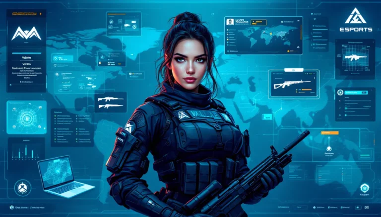
Esports Graphics & Team Branding
Esports organizations building team identity lean heavily on typography. An official team font creates consistency across social media, jerseys, overlays, and promotional material.
Best practices:
- Use a COD-inspired font for team name and logo wordmarks
- Keep the same typeface across all platforms (Discord server names, Twitch panels, Twitter bio, YouTube graphics)
- Pair it with a complementary sans-serif for body text and secondary information
- Build a color palette that feels cohesive with your chosen typography
Research from Dexerto and other esports outlets shows that consistent branding, including typography, correlates with team recognition and sponsorship success. When opponents, casters, and viewers see your team’s font, it should trigger instant brand recognition.
Custom Loadout Cards & In-Game Artwork
Content creators making custom loadout guides, weapon tier lists, and class breakdown graphics need fonts that communicate authority and clarity. COD fonts work here because they inherently feel authoritative and functional.
Application:
- Use a Black Ops–inspired font for tier rankings (S-Tier, A-Tier, B-Tier headers)
- Use Modern Warfare–style fonts for weapon names and stat breakdowns
- Create hierarchy: bold COD font for primary information, lighter secondary font for supporting data
- Add subtle military-inspired effects (subtle shadows, minimal borders) without overloading the design
When designing loadout cards, the font choice signals whether this is a competitive guide or casual content. Darker, heavier fonts read as “meta and serious,” while cleaner, modern fonts feel more accessible and beginner-friendly. The type itself tells a story about your content’s tone.
Installing & Implementing Call Of Duty Fonts On Your System
Windows & Mac Installation Guide
On Windows:
- Download your chosen font file (usually a .ttf or .otf file)
- Right-click the font file and select “Install” (Windows will automatically place it in the correct folder)
- Alternatively, manually navigate to
C:WindowsFonts, then drag and drop your font files there - Restart any open design applications
- The font will now appear in your application’s font list
On Mac:
- Download your font file (.ttf or .otf)
- Open Font Book (Applications > Font Book)
- Click the “+” button and locate your downloaded font file
- Font Book will ask where to install it: select “Computer” for system-wide access
- Restart design applications
- Your font is now available in all applications
Alternatively, you can drag font files directly into ~/Library/Fonts/ (use Cmd+Shift+G in Finder to access this hidden folder).
Using Fonts In Design Software
Once installed, your fonts appear in design applications’ font menus. Here’s how to use them effectively:
Adobe Creative Suite (Photoshop, Illustrator, After Effects):
- Open the Character panel (Window > Character)
- Click the font dropdown and search for your font by name
- Adjust size, weight, and letter-spacing to match your design intent
- Layer effects (Shadow, Outline, Glow) are found in the Effects menu: use sparingly for gaming aesthetics
Canva, Figma, or Browser-Based Tools:
- These tools often pull fonts from Google Fonts or custom font libraries
- If using premium fonts, you’ll need to upload them manually (Figma allows custom font uploads)
- Free fonts are typically already available in the platform’s font library
Web Design (HTML/CSS):
If you’re building a gaming website or Discord bot profile, you can embed fonts using @font-face:
@font-face {

font-family: 'CustomCOD':

src: url('path-to-font-file.ttf'):

}


body {

font-family: 'CustomCOD', sans-serif:

}
For streaming software like OBS, install the font on your system first, then access it through OBS’s text source properties. The font will appear in your system font list, and OBS will render it when you broadcast.
Common Questions About Call Of Duty Typography
Is The Official Font Free?
No. Activision and the individual game studios (Treyarch, Infinity Ward, Sledgehammer Games, Raven Software) have never publicly released official Call of Duty fonts for free. The fonts used in-game are either fully proprietary or custom modifications of existing typefaces, licensed specifically for the franchise.
But, this doesn’t mean you’re locked out. The free and premium alternatives mentioned above capture the aesthetic so effectively that most viewers won’t notice the difference. If you’re creating fan art or non-commercial content, these alternatives are perfectly legitimate and widely used by the gaming community.
Can You Use These Fonts Commercially?
It depends entirely on the font’s license. Always check before deploying any font commercially.
Google Fonts (free options like Roboto, Inter, Montserrat) are open-source and explicitly licensed for commercial use. You can safely use them in published games, streaming content, esports graphics, merchandise, and professional projects.
DaFont and similar sites offer a mix: some fonts are free for both personal and commercial use, others are restricted to personal use only. Always read the license file included with each download.
Premium fonts (Gotham, Brandon Grotesque, FF Unit) come with commercial licenses. You pay once for the license, then deploy freely. For esports organizations, streaming businesses, or game developers, this is the legally sound approach.
Fan-made Call of Duty fonts (custom fonts created by community members to mimic specific games’ typography) exist in a gray area. They’re fine for personal, non-commercial projects and fan content. Using them commercially without explicit creator permission is risky, you’re potentially infringing on both the font creator’s work and Activision’s IP.
When in doubt, create original designs, use established free fonts, or license premium fonts. It’s the safest path.
Which Game In The Franchise Has The Most Iconic Font?
Black Ops 2 takes this crown. The franchise’s popularity peaked around 2012–2013, and Black Ops 2’s typography became the visual symbol of that era. Streamers still use Black Ops–inspired fonts in overlays. Content creators reference that aesthetic constantly. Ask a casual gamer to picture “Call of Duty font,” and they’re picturing Black Ops’ heavy, angular, high-contrast look.
But, from a design standpoint, Modern Warfare 2 (2022) represents the current gold standard. Its typography is more refined, more legible across platforms, and more versatile for professional applications. Esports teams and professional streamers increasingly favor the cleaner Modern Warfare aesthetic.
The psychological preference for Black Ops says something about nostalgia’s power in gaming. That font carries memories of midnight launches, iconic YouTube moments, and the franchise’s cultural zenith. Meanwhile, The Loadout and other competitive gaming outlets frequently showcase Modern Warfare and Cold War aesthetics because they align with contemporary esports professionalism.
If you’re targeting broad appeal and nostalgia, go Black Ops. If you’re building professional esports or streaming content, Modern Warfare’s cleaner approach is more versatile.
Conclusion
The Call of Duty font isn’t just typography, it’s cultural shorthand for decades of gaming legacy. Whether you’re recreating the stark Black Ops aesthetic, channeling Modern Warfare’s contemporary polish, or bridging multiple eras, the tools and knowledge are at your fingertips.
You don’t need the official proprietary fonts to capture that iconic look. Free alternatives like Roboto, Inter, and Montserrat work beautifully for modern designs, while Orbitron and Space Mono nail the darker Black Ops vibe. If you’re building a professional esports team, streaming business, or commercial gaming product, investing in premium fonts like Gotham or Brandon Grotesque is money well spent.
The key is understanding that effective typography in gaming design isn’t just about the font itself, it’s about sizing, spacing, color, effects, and context. A standard sans-serif paired with the right color palette and layout can feel more authentically “Call of Duty” than a misused premium font.
Start experimenting. Download a few free options, install them, and test them in your design software. Compare them side-by-side against in-game screenshots from your favorite COD title. You’ll quickly develop an eye for what works. And when your overlays, loadout cards, or esports graphics feature typography that feels authentically Call of Duty? Your audience will feel it, even if they can’t name the specific font.