Table of Contents
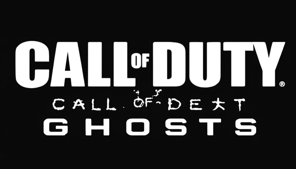
ToggleThe Call of Duty Ghosts logo isn’t just a piece of branding, it’s an iconic symbol that defined a generation of gaming from 2013 onward. When Infinity Ward unveiled this distinctive design, it immediately became synonymous with one of the franchise’s most memorable entries. Whether you’re a longtime fan, a casual player, or someone curious about gaming history, understanding the Call of Duty Ghosts logo reveals insight into how visual design shapes player identity and franchise recognition. This breakdown explores what makes the logo tick, how it’s evolved across marketing materials, and why it still resonates with gamers years after its debut.
Key Takeaways
- The Call of Duty Ghosts logo features a textured, battle-worn skull with white-on-black high-contrast design that communicates stealth, lethality, and covert military operations.
- Launched in November 2013 across multiple console generations, the logo became synonymous with a transitional gaming era and remains one of the franchise’s most recognizable symbols.
- Unlike sleeker alternatives in the series, the Ghosts skull embraces an organic, grittier aesthetic grounded in authentic special forces culture rather than futuristic minimalism.
- The logo’s design consistency—from tactical typography to textured iconography—creates cohesive branding that works effectively at postage-stamp size and massive scale.
- The Call of Duty Ghosts logo achieved significant cultural penetration through fan art, esports adoption, and meme culture, demonstrating lasting emotional connection with the gaming community.
- Official logo assets are available through Activision press kits and Steam store pages, while fan use for non-commercial creative projects typically qualifies as fair use under intellectual property guidelines.
What Is The Call Of Duty Ghosts Logo?
The Call of Duty Ghosts logo is the official visual identity of the 2013 game from the Call of Duty franchise developed by Infinity Ward. It features a stylized skull with tactical military aesthetics, specifically, a soldier’s skull painted or masked in a ghostly, skeletal design. The logo instantly communicates the game’s core theme: elite, mysterious operatives working in the shadows.
At its core, the logo represents the “Ghosts” themselves, an elite special forces unit operating as the player’s squad in the campaign. The skull imagery isn’t gruesome for shock value: instead, it’s calculated military branding. It signals stealth, lethality, and the covert nature of the operations players undertake throughout the game.
Unlike some Call of Duty logos that lean into futuristic or sleek minimalism, Ghosts’ design embraces a rougher, more organic approach. The skull has texture and character, giving it personality beyond a simple geometric icon. This distinction helps it stand out even when placed alongside other titles in the Call of Duty Archives, where dozens of logos compete for recognition.
Visual Design And Aesthetic Elements
Color Palette And Symbolism
The Call of Duty Ghosts logo employs a restrained color scheme that reinforces its military identity. The primary version features white and black tones, with the skull rendered in a bleached, bone-like white against dark backgrounds. This high-contrast palette ensures the logo remains instantly recognizable across any medium, from a 48×48 pixel favicon to a massive billboard.
The white-on-black approach carries symbolic weight. White suggests death, haunting, and the supernatural aspects tied to the “Ghosts” codename. Black represents darkness, shadow operations, and the secretive nature of the unit. Together, they create a visual language that’s inherently military yet slightly unsettling, perfect for a franchise built on delivering intense combat experiences.
Occasionally, the logo appears with accent colors like silver or metallic tones in promotional materials, especially on Call of Duty Cover Art and merchandise. These variations maintain the core aesthetic while adding depth and sophistication for premium applications.
Typography And Font Choices
While the skull dominates the visual identity, the “Call of Duty Ghosts” text beneath it uses a custom typeface that complements the skull’s aesthetic. The lettering is bold and angular, with no-nonsense spacing that conveys military precision. It’s not ornate or flowing, every character feels deliberate and authoritative.
The font avoids trendy sans-serif minimalism in favor of something with more presence. Letters have weight and substance, mirroring how the skull itself feels grounded and tactile rather than ethereal. This consistency between typography and iconography creates a cohesive brand identity that feels unified and professional.
Ghost Imagery And Icon Design
The skull itself is the anchor of the design. It’s rendered with environmental detail, not a clean, polished illustration but something that looks weathered and battle-worn. You can see texture in the bone, shadowing in the eye sockets, and a sense of three-dimensionality that makes it feel less like a logo and more like an artifact from the game world.
The ghost concept extends beyond just the visual. The painted or masked appearance on the skull suggests face paint, a nod to actual special forces operators who use similar markings for intimidation and unit cohesion. This attention to tactical realism grounds the design in authentic military culture rather than pure fantasy, which resonates with players who appreciate authenticity in their military shooters.
The spacing and composition around the skull is clean. There’s negative space that prevents the logo from feeling cluttered, and the overall silhouette is distinctive enough to work as a small icon or at massive scale. Game designers and marketers understand that a truly successful logo works when printed at postage-stamp size, and the Ghosts logo absolutely passes that test.
Historical Context And Release Information
Launch Year And Development Background
Call of Duty: Ghosts launched on November 5, 2013, simultaneously across PlayStation 3, Xbox 360, and PC. Days later, it arrived on PlayStation 4 and Xbox One, making it a launch title for the next generation of consoles. This timing was crucial, the logo became synonymous with a transitional moment in gaming, representing both the end of an era and the beginning of the eighth console generation.
Infinity Ward designed the Ghosts logo as part of a broader rebranding effort. The studio wanted to distance this entry from Call of Duty: Modern Warfare 3 while establishing a fresh identity. Modern Warfare had dominated for years, and Ghosts needed visual distinction. The skull-based approach proved immediately distinctive, becoming one of the franchise’s most recognizable symbols and influencing how subsequent Call of Duty games approached their own visual identities.
The game’s setting shifted from the Middle East to a near-future Earth ravaged by war, and the logo reflected that evolution. Instead of continuing the hyperrealistic soldier aesthetic of Modern Warfare, Ghosts embraced something darker and more theatrical. This design choice appealed to players looking for something visually different from what came before.
How It Compares To Other Call Of Duty Titles
Comparing the Ghosts logo to other Call of Duty branding reveals interesting design philosophy shifts across the franchise. Modern Warfare 3 used a more angular, tech-forward wordmark without a strong iconographic element. Black Ops series featured skull imagery too, but rendered in a cleaner, more geometric style with gold and red accents.
Ghosts’ skull is distinctly grittier than Black Ops’ offering. Where Black Ops leans into spy-thriller aesthetics with those metallic touches, Ghosts commits fully to the organic, weathered military look. The logo feels less “sleek gadget” and more “soldier’s war paint.”
In comparison to newer titles like Modern Warfare (2019) and Warzone, the Ghosts logo represents an earlier era of design language. Modern games have embraced minimalism and flat design: Ghosts’ textured skull feels almost analog by contemporary standards. Yet that very quality has aged gracefully, it’s clearly from that 2013-era without looking dated, similar to how a well-designed call of duty monster skin or character cosmetic from that era still looks acceptable today.
Logo Evolution Across Marketing Materials
Promotional Artwork And Variations
The Call of Duty Ghosts logo appeared across countless promotional materials between 2013 and 2015, and each iteration subtly adapted the design for its context. The primary logo, the skull with text, remained constant, but its application evolved significantly.
In movie-style trailers and cinematics, the logo often appeared overlaid on gritty military environments. Explosions, destroyed cities, and tactical operations framed the skull, reinforcing the game’s narrative of a war-torn world. This contextual application made the logo feel integrated into the game’s fiction rather than a separate commercial asset.
Merchandise adaptations saw variations too. T-shirts and hoodies sometimes enlarged the skull to dominate the chest while shrinking the text. Posters played with placement, positioning the logo off-center for dynamic composition. These weren’t reckless modifications, each variation maintained the core visual identity while adapting to the physical constraints and design conventions of the medium.
Special editions and DLC content generated alternate versions as well. Season pass artwork, map announcements, and cosmetic promotional materials sometimes incorporated the Ghosts logo in silver or neon-accented variations. These color shifts added visual interest while keeping the base design recognizable.
In-Game Logo Placement And Integration
Inside the actual game, the Call of Duty Ghosts logo served both functional and narrative purposes. Players encountered it in loading screens, menu backgrounds, and UI elements throughout the campaign and multiplayer. The consistent presence reinforced brand identity while players engaged with the actual gameplay.
In multiplayer lobbies, the logo appeared subtly in the background of map loading screens and in the game’s overall UI design language. Unlike some games that plaster logos everywhere, Infinity Ward showed restraint, the Ghosts branding felt integrated into the world rather than intrusive.
Customization emblems and clan tags allowed players to create squad identities referencing the logo, fostering community recognition. Players wearing ghost-themed emblems immediately communicated their allegiance and familiarity with the title. This organic adoption by the playerbase extended the logo’s reach beyond official marketing into authentic user-generated content.
In-game progression menus and rank rewards sometimes featured the skull imagery as well, creating visual continuity between the marketing materials players saw outside the game and the experience they encountered while playing. This cohesion strengthened the logo’s association with the entire Ghosts experience.
Cultural Impact And Recognition Among Gamers
The Call of Duty Ghosts logo achieved remarkable cultural penetration within the gaming community, becoming shorthand for an entire chapter of the franchise’s history. For players who came of age during the console transition of 2013-2014, the logo carries nostalgic weight, it represents countless multiplayer sessions, completed campaigns, and shared gaming moments.
On social media, fan art depicting the Ghosts logo remains prolific years after the game’s original release. Artists reimagine the skull in different styles, from hyper-realistic renderings to stylized interpretations. This organic fan engagement demonstrates the logo’s visual power and the emotional connection players maintain with the design.
Competitive esports communities also embraced the Ghosts branding. Clan teams, tournament organizations, and streaming communities adopted ghost-themed identities and logo derivatives. Resources like Dexerto frequently featured Ghosts-era esports content, cementing the logo’s association with competitive Call of Duty during that era.
In discussions about Call of Duty logo evolution, the Ghosts design consistently ranks among fans’ favorites. Polls across gaming forums and Reddit communities place it in the top tier of franchise branding, often praised for its distinctiveness and aesthetic appeal. Unlike some logos that feel generic when separated from their context, the Ghosts skull is instantly identifiable.
The logo also benefited from meme culture and online gaming discourse. References to “Ghosts” and the iconic skull permeate gaming communities, from YouTube comments to Twitch chat. This maintained cultural relevance even though the game’s 2013 release, keeping the logo visible in contemporary gaming conversations.
Where To Find Official Call Of Duty Ghosts Logo Assets
Official Sources And High-Resolution Downloads
Finding official, high-resolution Call of Duty Ghosts logo files requires knowing where to look. Activision’s official website occasionally maintains press kits and media resources containing official logo assets. These downloads typically provide the logo in multiple formats, PNG, SVG, and PSD, ensuring compatibility with different design workflows.
The Call of Duty franchise’s social media accounts on Twitter, Instagram, and Facebook occasionally share official logo imagery, particularly during anniversary celebrations or throwback content. These posts serve as legitimate sources for verified branding materials.
Press release archives from Activision and Infinity Ward sometimes include embedded high-resolution logo files. Gaming media outlets like IGN and other major gaming publications have archived official press materials dating back to the 2013 launch, including original logo assets used in promotional coverage.
Steam’s store page for Call of Duty: Ghosts contains various logo and artwork elements integrated into the game’s listing. While not all assets are immediately downloadable, they represent officially authorized imagery.
Using The Logo For Fan Projects And Communities
Fans and community members seeking to use the Call of Duty Ghosts logo for legitimate purposes should understand intellectual property considerations. Activision owns the logo, and using it requires either explicit permission or falling within fair use parameters for educational or critical content.
Fan sites, community wikis, and gaming forums can use the logo for identification and discussion purposes, which typically falls under fair use. But, creating merchandise or commercial products using the logo without authorization violates trademark law.
Content creators on YouTube, Twitch, and other platforms commonly use the Ghosts logo in thumbnails, overlays, and channel branding for gameplay content. This falls within fair use for transformative content, the logo serves as identification rather than replication of the protected design for commercial gain.
Community projects like custom emblems, in-game cosmetic suggestions, and fan art inspired by the logo are perfectly acceptable. These creative interpretations celebrate the design without copying it directly or profiting from Activision’s intellectual property.
For anyone developing gaming guides, tutorials, or educational content about the Ghosts logo’s design history, like content you might find on The Loadout, using the logo for illustration and analysis generally qualifies as fair use. The key distinction is that you’re commenting on or analyzing the design rather than reproducing it for commercial purposes.
Conclusion
The Call of Duty Ghosts logo stands as a testament to effective visual design in gaming. Its combination of tactical skull imagery, restrained color palette, and weathered aesthetic created a brand mark that immediately communicated the game’s identity while remaining instantly recognizable across contexts.
From its November 2013 launch across multiple console generations to its continued presence in gaming culture, the logo has proven remarkably durable. It balances artistic sophistication with commercial functionality, equally effective as a website favicon or a large-scale promotional graphic.
What makes the Ghosts logo particularly interesting is its authenticity. Rather than chasing trends, the design commits to a specific military aesthetic grounded in real special forces culture. This integrity has allowed it to age gracefully: it doesn’t feel dated even as gaming design language has shifted toward minimalism and flat aesthetics.
For gamers, the logo remains a cultural touchstone, a symbol of a specific era in Call of Duty’s evolution when the franchise was redefining itself for a new console generation. Whether you’re revisiting the game, studying gaming design, or simply appreciating iconic branding, the Call of Duty Ghosts logo deserves recognition as one of the franchise’s most successful visual identities.